Christine Seed
Christine Seed
UX and UI Designer | Visual Communicator

FEED THE CHILDREN | WEBSITE AUDIT AND REDESIGN | CLIENT PROJECT

How can we redesign the Feed the Children website so that visitors will be more inclined to donate and get involved with the organization?


Overview

Feed the Children was established over 40 years ago, and is one of the leading anti-hunger organizations in the world. Based in the US, but also providing their services to countries in Asia, Africa and Latin America, Feed the Children aims to raise awareness about childhood hunger and put an end to it by connecting donors, partners, experts, volunteers, leaders, and communities.

What we did

While Feed the Children is a well-established nonprofit, they struggle to convert their name recognition into donations. In order to help understand why this discrepancy exists, as well as how to improve it, we focused our research on three key objectives:

  1. Develop personas based on a deep understanding of Feed the Children's donors and potential donors.

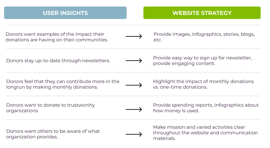
  2. Propose a redesign of the website experience based on these personas.

  3. Propose ways to increase engagement and donations to Feed the Children’s cause.

Project Overview

Three week sprint

Team of four UX designers

My Role

UI design lead

Website audit

UX research

Wireframing

Tools

Figma

Adobe Illustrator

Trello

Blue bar@2x.png

1. Discover

  • Comparative and Competitive Analysis

  • Secondary Research

  • User Interviews with Potential Donors

  • Current Website Audit

We started by seeking to gain a clear understanding of who donates to nonprofits and why. We did this through interviewing people who have donated to nonprofits in the past, but never to Feed the Children. We also conducted secondary research on donor behaviors and motivators.

We also wanted to get an understanding of where Feed the Children currently sits amongst its competitors, so we conducted a thorough Competetive and Comparative Analysis. Finally, we completed a Website Audit to understand what content is currently on the site, as well as to help us map out the current Information Architecture.

Comparative and Competitive Analysis

We conducted both a Task Analysis and a Feature Analysis of a total of 21 websites

  • Goal of the Task Analysis: To identify the steps a user takes to start monthly donations online and identify opportunities for improvement.

    • What we found: Anywhere 7-12 user actions/inputs required within 2-3 screens. Feed The Children required the fewest actions/inputs. We did not identify ways to shorten or improve this process.

  • Goal of the Feature Analysis: To identify website features that allow donors to donate, contribute or engage with an organization.

    • Features we identified across the various sites:

      • Homepages: Donation call to actions (CTAs)

      • Ways to pay: Credit card, bank account transfer, online payment system/mobile pay

      • Ways to donate/give: One-time/monthly donations, cryptocurrency, fundraising, IRAs/stocks/bonds, participating restaurants/stores, live streaming


Secondary Research

I conducted a review of existing literature on motivators behind charitable giving, as well as demographic predictors of those who give. Key takeaways from this Secondary Research were:

  1. Donors fall into two main categories: those that give based on a rational appeal and those that give based on an emotional or empathetic appeal.

  2. Donors want to know where their donations are being spent.

  3. Giving behavior is positively related to how much they trust the organization / how transparent the organization is.

  4. Higher education, religious affiliation, and higher income levels are all positively associated with giving patterns.

  5. Donors might stop donating to an organization based on poor content.

  6. Most donors prefer short, self-contained content.

  7. Donors feel more engaged when they receive content that is personalized.


Turning Research into Strategy

Our interviews helped us further define our ideal user’s motivators to give. We took the insights gained from these interviews, as well as our secondary research, and translated them into actionable website strategies.


Understanding the Current Website: Content Audit, Site Map, and Card Sort

Our research goal for this phase of the project was to understand the current website - its content, its architecture, and its flow.

First, we conducted a thorough audit of the current website using a content audit rubric. In our initial combing over of the site, we identified 61 stand alone pages to focus on for the content audit. 

A representative sample of the website audit spreadsheet

Using principles of good user interface design and Laws of UX, we examined each of the 61 pages one by one, looking for what was working and what could be improved.

At the same time, we also created a sitemap that illustrates the relationship between all of the pages. Looking at the site visually helped us to understand the flow of the pages and let us see how users could get from point A to point B. 

The website sitemap

During the creation of the current IA map and the content audit, I also discovered the following issues:

  • There are eight distinct root URLs in the ecosystem of the site

  • Over 75% of the pages are too dense and text heavy

  • The CTAs are inconsistent throughout

  • The video hosting is inconsistent (some with YouTube, some with Vimeo)

  • There is no breadcrumb navigation


Information Architecture key takeaways:

  1. There is a lot of content on the current website.

  2. The pages could be reorganized in a way that would better serve the users and the organization.

  3. There is a great opportunity to condense unique pages by combining information, removing duplicate pages, and deleting content altogether.

 
Blue bar@2x.png

2. Define

Defining the User Experience

  • User Personas: Barbara and Billy

  • Problem Statement and How Might We Statements

  • Journey Mapping

  • Proposed New User Flow

Defining the Information Architecture

  • Proposed New Sitemap

  • Tree Testing and Card Sorting

Defining the Design Strategy

  • Design Studio to ideate possible solutions around prioritized features


Defining the User Experience: Personas

BARBARA

“I want to support organizations that make what they do clear. I want to see the impact my donation is making.”

Noteworthy Behaviors
Barbara has donated to nonprofits, but has not yet donated to Feed the Children.

Habits and Motivators

  • She has donated to another nonprofit consistently for several years.

  • She donates to a cause when she feels an emotional connection.

  • She is invested in the well-being of children.

Wants and Needs

  • Wants to donate to a nonprofit organization that can best leverage her support to directly address the well-being of children.

  • Wants to promote the services this nonprofit provides in case others in her network may benefit from them or contribute to them.

  • Wants communication from the organization at least twice a month.

Pain Points

  • Nonprofit sites do not provide clear examples of their impact on communities.

  • Nonprofits do not communicate their mission and scope of services effectively, making it difficult to champion their cause.


BILLY

“I can and want to give more to the right people.”

Noteworthy Behaviors
Billy has been making smaller donations to Feed the Children for several years.

Habits and Motivators

  • Donates to a cause when he feels an emotional connection.

  • Motivated to donate by statistics and images of those in distress.

Wants and Needs

  • To donate to a nonprofit he deems trustworthy.

  • Wants to be secure in his finances and, by extension, his level of risk before donating - he does not want to be made a fool of.

  • Is thinking about his legacy as a philanthropist and wants to pass this down to his children.

  • Prefers communication from nonprofit on quarterly or more basis.

Pain Points

  • Has to spend too much time navigating websites to find information that tells him where/how his money is being spent.

  • Has seen a lot of scandals in the past, so has a hard time knowing if he can trust a nonprofit.

  • Nonprofits with unclear missions and financial transparency.


Our User Personas led us to our Problem Statement and three How Might We Statements

Problem Statement

Donors want to make an informed decision about their donation to Feed the Children but cannot easily access information on how their money is spent and the impact it has on communities on Feed The Children’s website.

How Might We?

1. Limit the time donors spend searching for financial statements on Feed the Children’s website?
2. Provide donors examples of the impact their donations will have on their communities?
3. Provide this information to donors while requiring minimal effort on their behalf?

Barbara’s Journey Map

Proposed New User Flow


Defining the Information Architecture: Proposed New Sitemap

Our goal was to design an improved website that would motivate users to donate.

3. Design

  • User Flows

  • Sketches

  • Wireframes

Through an iterative process of sketching, wireframing, and building out prototypes, our proposed redesign evolved. Our style decisions were impacted by our user research, principles of good design, and user testing.


Ideas from our Design Studio that made it to implementation

Wireframes

As the lead UI Designer, I created 11 fresh wireframes to show the Feed the Children staff how their website could be reimagined. These wireframes turned into our finished prototype.

Blue bar@2x.png

4. Deliver

  • Usability Tests

  • Prototype Iterations

  • Recommendations and Next Steps Document


usability testing insights

  • Users did not expect to find financial transparency info under ‘About Us’

  • Donation process was easy, but users expressed that informational content on left was distracting.

  • Wants more information on the community of donors - who’s donating, how much, what’s the goal?

  • On the donation process: simple for all users. CTAs were easy to locate.

  • On Feed The Children’s other programs/services: 4/5 users could not recall what other programs/services are provided. “I appreciate they spend the majority of their money on helping people and programs. I would like to know more about what that means”

    Success rates
    Task 1 - Domestic efforts: 5/5
    Task 2 - Financial transparency: 3/5
    Task 3 - Donation process: 5/5

Iterations for Second Round of Testing

  • More research into which content users want to see - what content informs their decision to donate? What content do they want to read in-depth? What content do they only want the important details from? What pages see the most interaction?

  • Replace text with infographics when appropriate

  • Separate financial transparency info from rest of ‘About Us’ page

  • Research ways donors may feel more involved in community. Based on interviews, donors want to actually see the impact of their donations within the communities, they also like to be kept in the loop regularly via newsletter.

  • Trim copy; emphasize key details and provide to users early on, give users the option to read more in-depth if desired.

Recommendations and Next Steps


  • Add a search / filter function to all the "Stories" pages

  • Move all videos to a single video platform and redirecting the user to more Feed the Children videos once a video is over (instead of a random video)

  • Create consistent CTAs throughout the site

  • Trim and edit the content so that the pages are not as text heavy

  • Integrate additional payment methods such as Apple Pay and Google Pay

  • Mask and redirect URLs so that the user is staying in the www.feedthechildren.org website at all times

  • Purchase and connect www.feedthechildren.com

  • Clarify messaging around The Table and monthly giving

  • Add breadcrumb navigation to make it easier for users to know where they are at all times

  • Consider using overlays and anchor links to present the same amount of information but in a "lighter" way

  • Research into what content users want to see - what content informs their decision to donate? What content do they want to read in-depth?

  • Research ways donors may feel more involved in community. Based on interviews, donors want to actually see the impact of their donations within the communities.

  • Deep dive into Google Analytics. Where are users spending their time and what are they doing while they are on the site?

Blue bar@2x.png